Natural, fluid organic shapes
Web design is evolving, moving beyond traditional geometric layouts toward organic shapes, thumb-friendly navigation, and glitch effects. These trends enhance user engagement, create visually appealing designs, and improve mobile usability.
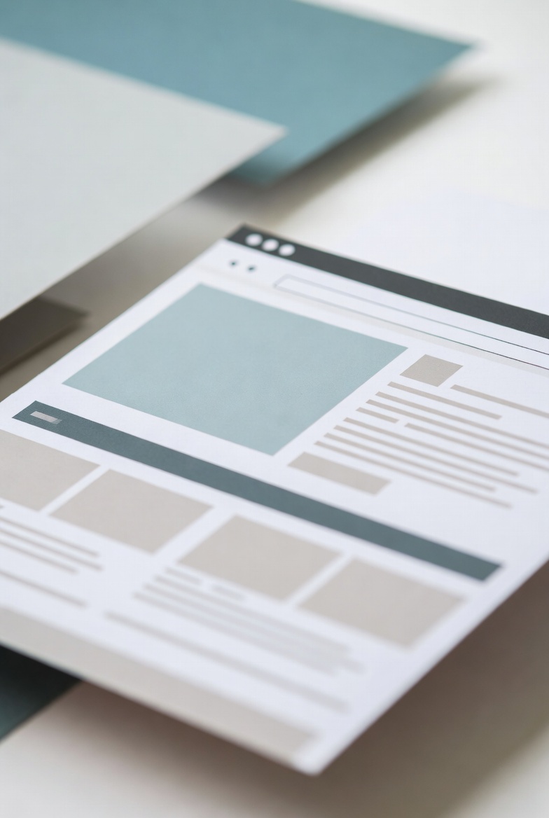
1. Organic & Asymmetric Shapes
While geometric shapes like squares and triangles have long dominated web design, organic and asymmetrical shapes are becoming more popular. These natural, fluid elements:
✅ Add depth and movement to the design.
✅ Create a more dynamic user experience.
✅ Make websites visually engaging and unique.
For example, Inkyy’s website embraces organic shapes, making it feel more modern and inviting.
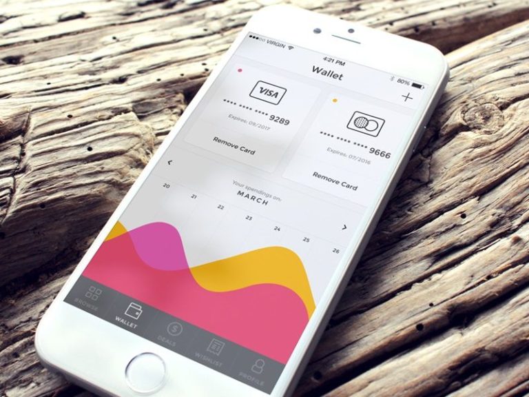
2. Thumb-Friendly Navigation
As mobile browsing increases, web design is shifting beyond simple responsive layouts to thumb-friendly navigation. Since most users operate smartphones with one hand, menus and buttons should be placed where the thumb naturally reaches.
A great example is Ionut Zamfir’s Wallet UI, where all navigation options are positioned at the bottom for easy access.
Best Practices for Thumb-Friendly Design:
📌 Keep navigation elements within thumb reach.
📌 Use larger tap targets for easy clicking.
📌 Optimize mobile menus for one-handed use.
3. Glitch Art for a Unique Visual Experience
Glitch effects, inspired by distorted images and broken visuals, create a futuristic and artistic feel. Websites like Active Theory use glitch art to grab attention and create a memorable experience.
Conclusion
Embracing modern web design trends like organic shapes, thumb-friendly navigation, and glitch effects can make your website more visually appealing and user-friendly. Stay ahead by integrating these elements into your site today!