
With over 2 billion websites online, standing out requires more than just having a digital presence. Shockingly, 90% of websites are inactive—meaning they lack traffic, fail to engage visitors, and don’t generate conversions.
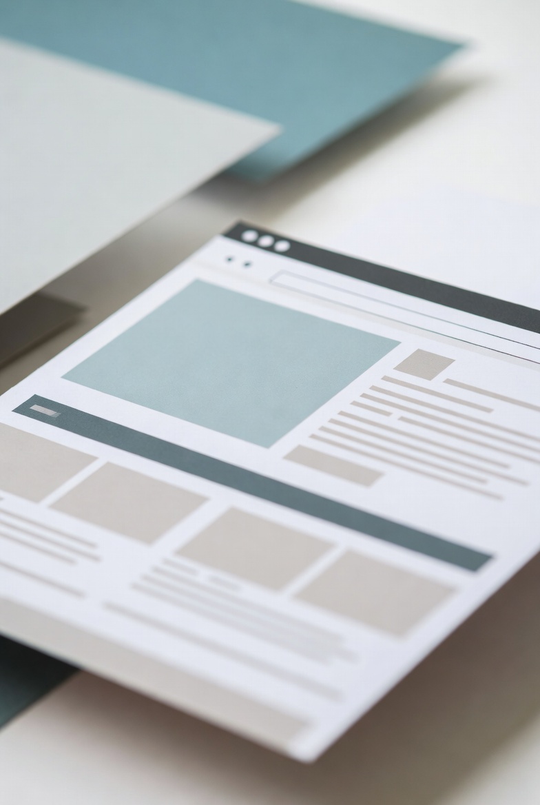
To ensure your website ranks among the top 10% of high-performing sites, it must be visually appealing, user-friendly, and strategically designed to meet business goals. Below, we’ll explore 8 essential website design principles that enhance usability, boost conversions, and improve SEO rankings.
1. Align Website Design with Your Business Goals
Your website should visually reflect your brand and purpose while keeping users engaged. Poorly designed sites often have:
❌ Too many clashing colors – Leads to visual overload.
❌ No clear hierarchy – Users don’t know what to focus on.
❌ A lack of direction – Visitors leave without taking action.
How to Fix This:
✔ Define your website goal – Lead generation, sales, engagement, etc.
✔ Choose colors based on your industry – Example:
- Fashion/Beauty: Soft tones (light blues, pinks).
- Food & Beverage: Reds and yellows (McDonald’s, Burger King).
✔ Structure content strategically – Highlight key messages and CTAs prominently.
A well-planned website layout improves usability, making it easier for visitors to engage with your content and convert.
2. Implement Visual Hierarchy for Better User Experience
Users naturally focus on larger and brighter elements first. This is why Instagram’s homepage directs attention effectively:
📌 Brand name “Instagram” in bold black font – Establishes brand identity.
📌 A large, colorful iPhone image – Draws users in.
📌 Blue “Log in with Facebook” button – Encourages a quick, easy sign-up.
Key Takeaways:
✔ Use larger fonts & bright colors for key elements.
✔ Position important content above the fold (where users first land).
✔ Make CTAs stand out with contrasting colors.
A strong visual hierarchy improves navigation, helping visitors find what they need faster.
3. Use the Golden Ratio for Balanced Design
The Golden Ratio (1.618) is a timeless design principle used in architecture, art, and web design.
🔹 It creates visually harmonious layouts that naturally guide the user’s eye.
🔹 The ratio appears in nature, from flowers to seashells, making it psychologically pleasing.
How to Apply It to Website Design:
✔ Structure your homepage using the Golden Spiral – Place key elements along the curve.
✔ Balance text and images effectively to prevent overcrowding.
✔ Ensure spacing and proportions feel natural for a smoother user experience.
Using the Golden Ratio makes your website visually appealing, increasing time spent on the page.
4. Apply the Rule of Thirds for Perfect Image Placement
When adding images, apply the Rule of Thirds to enhance visual balance.
How to Use It:
✔ Divide images into a 3×3 grid.
✔ Position focal points along intersection lines (where eyes naturally focus).
✔ Place CTAs, headlines, or key info on these intersections.
A well-placed image or CTA grabs attention faster, improving engagement.
5. Use the Law of Similarity for Better Organization
The human brain naturally groups similar elements together. Websites that organize content effectively reduce confusion and increase usability.
Example: Slack’s homepage
📌 Aligns related elements (brands, features) in equal-sized boxes.
📌 Keeps spacing consistent for a clean and structured look.
📌 Ensures visitors immediately recognize related content.
Best Practices:
✔ Keep similar items together – Organize products, testimonials, or features in uniform grids.
✔ Ensure spacing and alignment are consistent.
✔ Use uniform colors or icons to indicate related sections.
A well-structured website improves user experience, keeping visitors engaged longer.
6. Choose the Right Color Palette for User Engagement
Color psychology plays a huge role in user perception and decision-making.
🎨 Best color choices by industry:
✔ Tech & Finance – Blue (trust, professionalism)
✔ Luxury Brands – Black & Gold (prestige, exclusivity)
✔ Health & Wellness – Green (freshness, relaxation)
✔ Entertainment & Social Media – Red & Yellow (energy, excitement)
A strategic color scheme enhances brand perception, making your website more memorable.
7. Ensure Mobile-Friendly, Responsive Design
With over 50% of web traffic coming from mobile devices, responsive design is critical.
Mobile-Friendly Best Practices:
✔ Use a responsive layout – Automatically adjusts to different screen sizes.
✔ Optimize images & videos – Prevents slow loading times.
✔ Use larger buttons & touch-friendly navigation – Enhances usability.
A mobile-optimized website ranks higher on Google and provides a seamless user experience across devices.
8. Optimize for Faster Load Times
A slow-loading website kills conversions—53% of users abandon pages that take over 3 seconds to load.
Ways to Speed Up Your Website:
✔ Compress images – Use tools like TinyPNG or JPEG-Optimizer.
✔ Minimize HTTP requests – Reduce plugins, scripts, and unnecessary elements.
✔ Enable browser caching – Store data locally for faster access.
✔ Use a Content Delivery Network (CDN) – Boosts performance globally.
📌 Use GTMetrix or Google PageSpeed Insights to test load times and improve performance.
Final Thoughts: Build a High-Performing Website
A well-designed website isn’t just about aesthetics—it guides users, encourages engagement, and drives conversions.
By implementing these 8 essential website design principles, your site will be:
✔ Visually appealing – Aligns with industry trends.
✔ User-friendly – Easy navigation and strong CTAs.
✔ Optimized for conversions – Clear hierarchy, mobile-friendly, and fast-loading.
🚀 Need expert web design help? Work with a professional designer to create a high-performing, user-centric website!