Why You Shouldn’t Hire a Cheap Website Design Company
August 21, 2020
How to Improve Your Website: 10 Ways to Fix Your Site Immediately
December 2, 2020Think of your website as your calling card. Users come across your home page and at this point they have a couple of choices – Move on to another section of your site by way of getting to know your brand better or, instantly turned off, they navigate away never to be heard from again. You get the basic idea here.
First impressions (especially where websites are concerned) count, as do second, third and fourth. Your site may make a stellar first impression, but will it follow that up with more positive impressions? One of the ways to ensure that yours is an impression-making machine is through great website design.
And while yes, images and videos are a huge part of establishing the “greatness” of said site, there are a number of other key components and strategies that go into a killer site when all is said and done. Below are fifteen such hallmarks of what goes into taking a site from so-so to superior.
1. Ease of use
This is probably as common sense as it gets in terms of what people expect and need out of a website before they commit to scrolling through it. User experience (UX) should be at the heart of any good design. Users don’t have a ton of time to waste trying to find the page or section they need. They want it fast and findable…two “Fs” that are critical for creating a user-friendly experience.
2. Optimized for mobile
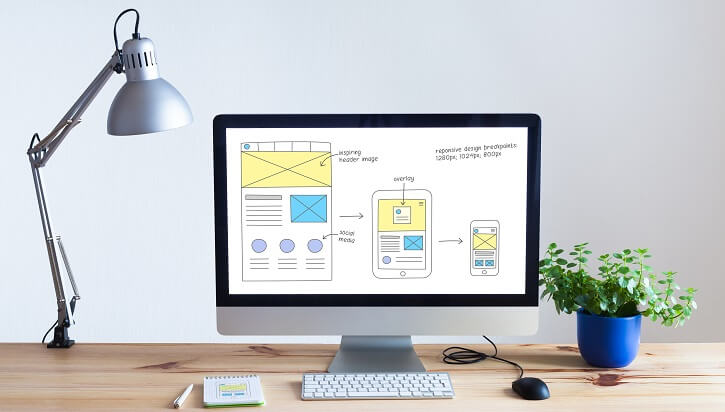
Do a quick search of how often people use their devices to visit a website versus their PCs or laptops. The numbers tend to weigh heavily in favour of the former category—at least as far as initial visits. If your site isn’t optimized to appear on a mobile device, if in other words it doesn’t perform as well on a smartphone or looks amateurish and clunky, you’re likely to frustrate and annoy visitors.
3. Fresh content
The worst thing you can do in terms of your overall website design is to utilize content that is stale and flat, or worse, somehow regurgitated (and not very well) from another site. Sites that continuously put up fresh content and do so with an eye on differentiating themselves from their competitors are always more successful.
4. Visually appealing
No brainer, right? When a user visits your website, if that site is lacklustre and/or just plain boring to look at, odds are they’re not going to be there very long. Give it interest. Ensure that it has depth and flare in terms of its overall visual appeal. But at the same time, refrain from overly complicating the site. Sometimes the most appealing sites have an inherent simplicity that serves to reassure the user.
5. Strategic use of images
Pictures are often worth more than a thousand words, which is why strategically integrating photos and other such images into your website design is crucial. Let’s face it, the average user would rather “see” something than merely read about it. You have to give them the best of both worlds—integrate text/content that is fresh and informative and use photos and graphic images to create a multi-dimensional user experience.
6. Identifiable navigation menu
Trends definitely do come and go, but when it comes to your site’s navigation menu, sometimes trendy isn’t always effective. If a user has to search around your landing/home page just to locate the menu which will enable them to move to other sections of the site, this isn’t exactly conducive to an easy interaction.
Keep navigation menus toward the top. Make sure it is recognizable as a site menu. Being clever with page/section names is okay to an extent, but if it leaves visitors scratching their heads as to what exactly that page or section is about, perhaps not the best strategy.
7. Calls to action apparent
People who are visiting your website are doing so for generally one of two reasons: they may be curious about your brand or they are potentially interested in purchasing something. That said, if your website lacks any clear call(s) to action, the person will inevitably leave without doing anything. If you want them to buy—call them to do so. If you want them to listen to a podcast—say this. If you want them to subscribe to your email list—be specific.
Related Read: 8 Persuasion Hacks That Influence People to Buy from You
8. Contact info is accessible
One of the worst things you can do is to bury your contact info, to include a phone number, email address and physical location so far deep that users are unable to find it. Make sure that some element of your contact information—be it a phone number or email address—is easily findable on every single page/section.
9. Functional
You’d be surprised at how many people just overlook the overall functionality of a website. Every page has to “work,” in other words. Broken links, things not loading or not loading fast enough, buttons that don’t do what they say they do, all lead you to the same thing, an angry visitor.
10. Consistent feel/look
Consistency as with most things is key, especially when it comes to great website design. If pages/sections are discordant, if they fail to flow together well, if random themes are haphazardly tied together, the entire site suffers. Keep it consistent!
11. Incorporates video
Pictures and text are certainly essential elements of any website design, but the video should also be included. In fact, more websites than ever are integrating videos. And there are numerous ways to use video in your site design. Video is more engaging, it offers a more interactive experience, and it helps your site get found more frequently.
12. Considers SEO
A part of designing your site should be including those elements that lend themselves toward boosting SEO. You could have the most interesting site in the world, but if you’re not getting found, what purpose is it serving. There are a ton of different SEO strategies and methods; unless you yourself are well-versed in all things SEO, you might want to consult a firm/individual who specializes in on-page optimization techniques.
13. Social share buttons and links
Your website is not the end-all and the be-all of your online presence. In some ways, social media platforms are eclipsing websites as the go-to in terms of introducing your brand to the world. As such, you want to make sure that your site “talks” to your Facebook page, your Instagram account, your Twitter feed, any and all relevant social media. Have buttons and links embedded in your site and vice versa.
14. Includes white space
Don’t be afraid of those blank areas. The eyes need a rest time and again. If the site is overly cluttered and there’s a constant barrage of images and text, the effect could be dizzying. White space can be your friend when used strategically.
15. Has a clear purpose
Again, a seemingly basic one and yet ever so important when striving to cultivate great website design. What is your purpose when it comes to your site? What ultimately would you like it to accomplish? Whether getting users to purchase something, sign up for something, or comment on something—make sure the purpose is clearly identifiable and aligns with your ideal user.
Certainly, a great website has many more qualities. But these are some of the important ones to keep in mind. If you need any advice on how to make your website better and more conversion-friendly, feel free to contact us.


